We’re proud to unveil a bold new chapter in the Stow Healthcare story. Built on a legacy of compassion, excellence, and family values, our refreshed brand reflects who we are today and our vision for the future.
As our organisation continues to evolve, we’ve explored how best to present ourselves as a brand, and we’re delighted to share something special: the launch of our refreshed brand identity at Stow Healthcare.
Rooted in a strong heritage of exceptional care, this update represents a thoughtful step forward. With a modern, fresh look, our new identity reflects not only who we are today, but where we’re headed, ready to grow and adapt as our business flourishes. It’s more than a visual update; it’s a renewed expression of our values, our commitment to excellence, and our vision for the future.
What’s New?
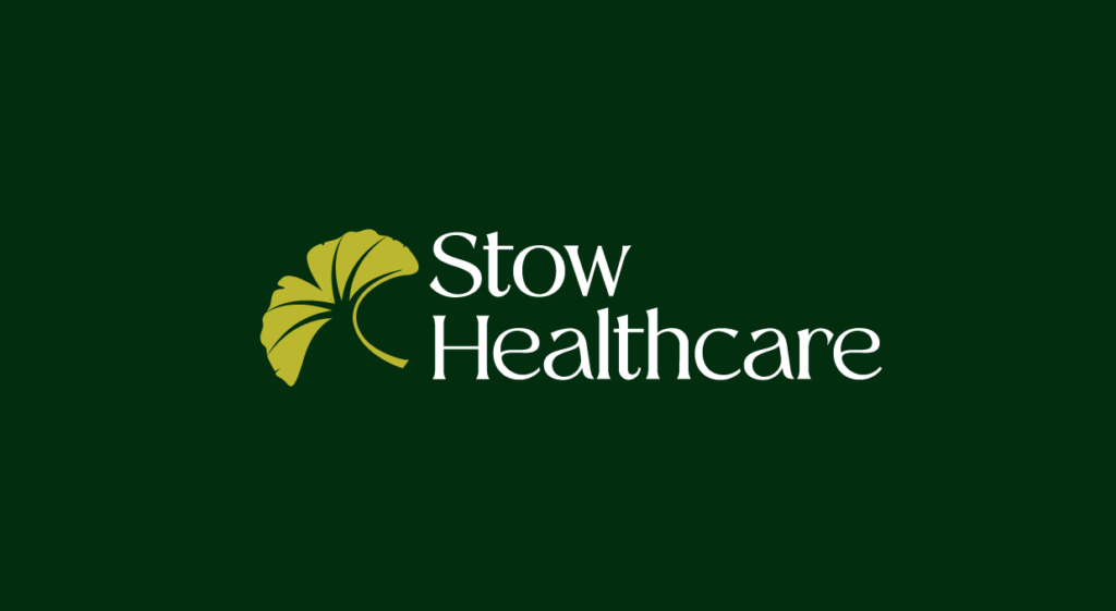
A Symbol with Meaning
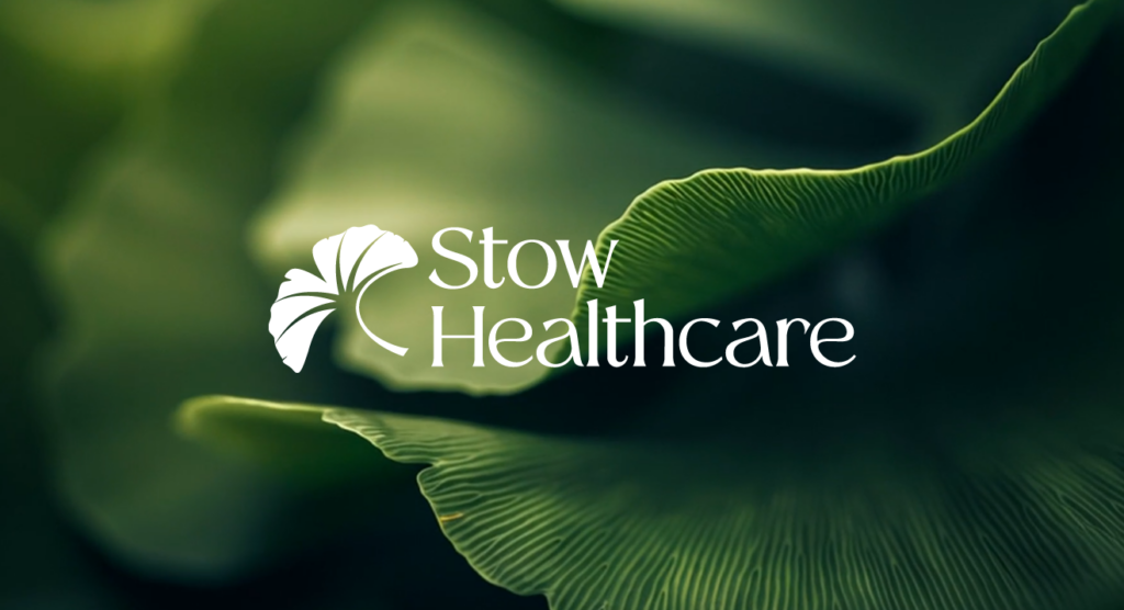
One of the most significant changes is our logo. We’re introducing the ginkgo leaf, a powerful symbol of longevity, resilience, hope, renewal, and balance. The ginkgo is also associated with memory and cognitive health, aligning perfectly with our mission to provide outstanding care. Adding to its significance, ginkgo trees grow in Suffolk, the home of our very first Stow Healthcare care home, creating a local connection that makes this choice even more meaningful.
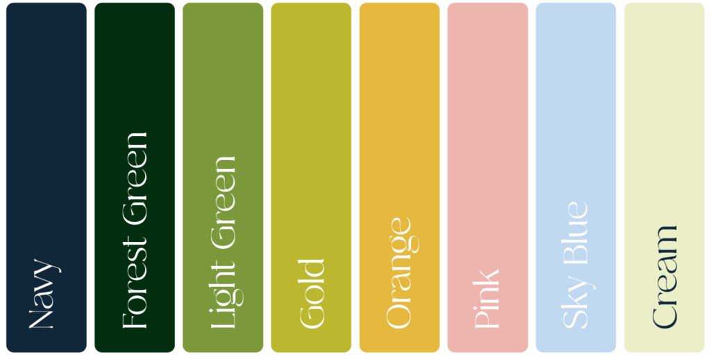
A Fresh Colour Palette
Our new palette combines navy and forest green for strength and trust, complemented by warmer tones that evoke joy and celebration, and softer hues for calm and empathy. These colours will help us communicate with clarity and warmth across all touchpoints.
Typography That Welcomes
Our new typeface brings a friendly, approachable feel to our communications, ensuring that every interaction reflects the care and professionalism we stand for.
A Message from Our CEO
“Now that our new branding is out in the world, it has been wonderful to see how strongly it resonates across our homes and the wider care sector. It expresses our commitment to quality, compassion and innovation in social care. My thanks go to our remarkable marketing team, whose vision and hard work have brought this evolution to life so beautifully.”
Kay Cox, CEO, Stow Healthcare
Representing longevity, hope, and balance, the ginkgo perfectly aligns with our mission to deliver outstanding care, always putting our residents first. Our new colours, typeface, and visual style bring warmth, clarity, and confidence to everything we do.
This is more than a makeover; it’s a renewed promise to our residents, families, friends, and colleagues. Together, we’ll ensure our brand reflects not only what we do, but why we do it.
We’re rooted in heritage, but ready for tomorrow.